Kapybara: AI-powered Beauty and Wellness Marketplace
Ukraine
Beauty
6 months
Project Manager, QA Specialist, 2 Full-stack Developers
MVP Development
React Native, Firebase
-
40K
Active Users
-
37
Countries
-
4M
Monthly Recipe Views
About Client
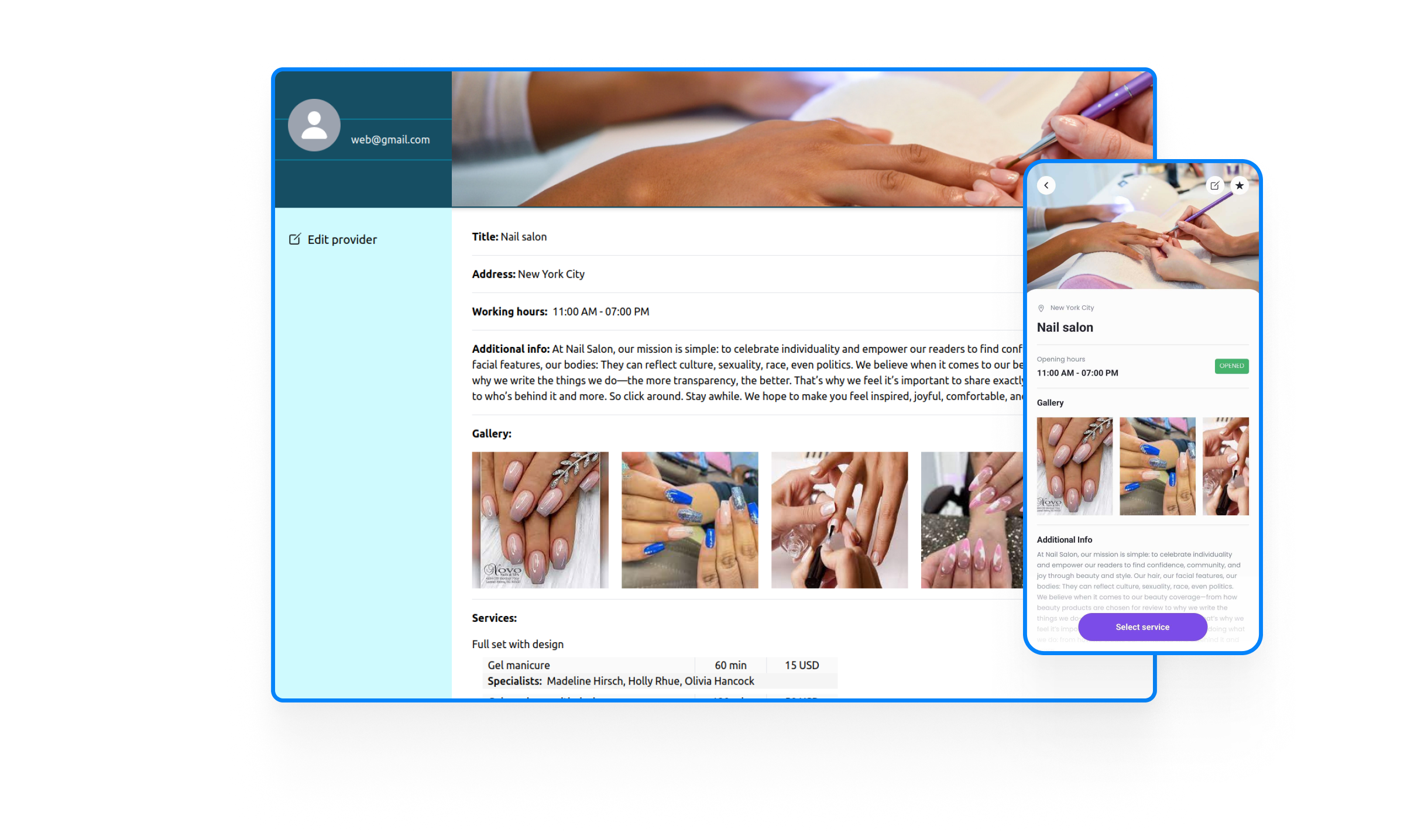
Our client, a stickler for quality, recently relocated to a new city. This move brought forth a familiar challenge: finding personal care professionals who could meet exacting standards. The traditional methods of searching through countless Instagram profiles proved to be both time-consuming and inefficient.
Having the need for a more attentive approach, our client, relying on her IT background, envisioned a platform that could enhance the service in the beauty and wellness industry. This vision was born from a desire to connect clients with requested professionals who could provide services tailored to their standards.
By creating an app that would help users effortlessly match with skilled beauty and wellness specialists, our client aimed to address the pain points experienced by many. The goal was to provide a solution that would not only save time but also enhance the overall beauty and wellness experience.
The Challenge
We took the project over from the previous team. The process of transferring the work was challenging in itself. The system had to be continuously developed, while the deFor many, navigating the beauty industry might be a quest. Especially when you’re new at the place and can’t ask for recommendations. We had to not just create another directory but develop a system that understands and matches client requests with the right professionals. That’s why we had the following challenges in the app creation:
- Perfect match: Crafting an intelligent system that aligns with user expectations.
- User Experience: Ensuring the search is intuitive and not time-consuming.
- Quality Assurance: Ensuring that only experienced and qualified service providers are represented on the platform.
Goals

Accessibility
The platform aims to be universally accessible, offering a seamless experience for users with disabilities or who are visually impaired.

Time Efficiency
Our goal was to free up valuable time for client consultations and treatments by streamlining administrative tasks within the CRM.

Personalization
Leverage cutting-edge AI to create a personalized service-matching experience, ensuring users connect with the perfect professionals.
Dev Process
Image Search
We added an AI-based image search feature. Users can upload a photo of the desired style, and our AI will intelligently match it with beauty specialists who can bring the vision to life. AI was envisioned to not only recognize images but to intelligently match them with beauty specialist profiles based on services, user preferences, and stylistic elements gleaned from image analysis. This goes beyond simple keyword searches, fostering a more nuanced understanding of style and technique.
User-Centric Registration
We’ve offered users an experience that empowers them to explore the app and its features. We wanted to make the user’s first interaction with the platform as inviting as possible. The team developed a preview mode that allowed potential customers to browse services and explore the app’s functionalities without the need for immediate registration.
Effortless Specialist Onboarding
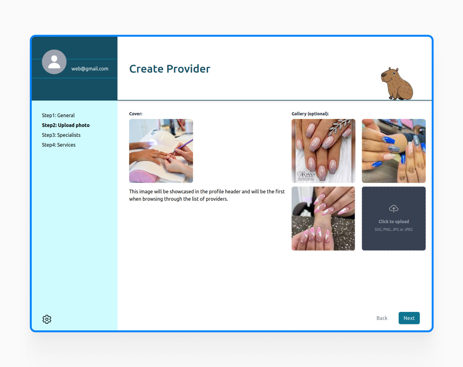
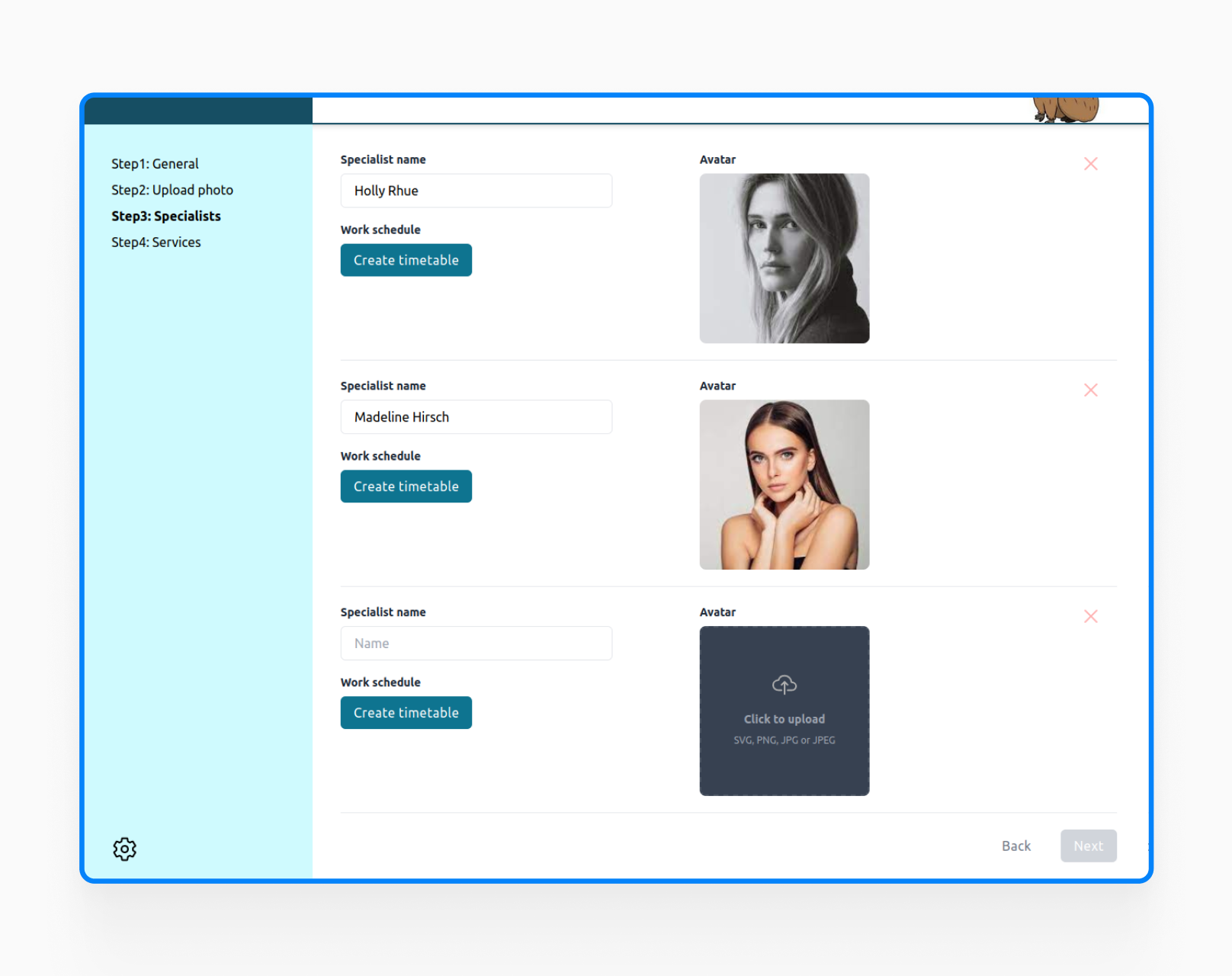
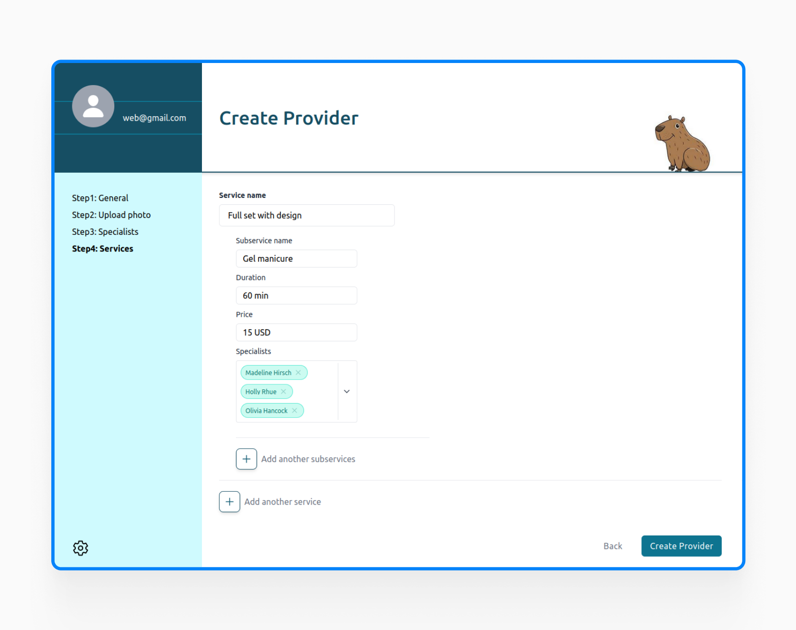
Respecting specialists’ valuable time, the platform was designed for a quick and intuitive setup process. After profiles are created, service providers can list their offerings, manage schedules and also integrate existing calendars for real-time availability – all in minutes.
Design Process
User Research
The design team conducted extensive interviews with both service providers and potential users. Such an approach helped us prioritize features and design an intuitive user interface that covers real-world needs.
Team Collaboration
Every team member’s unique perspective (experiences and expectations) fueled the design process, resulting in an inclusive and personalized user experience.
Branding with Symbolism
Our mascot, the Capybara, embodies warmth and self-care, qualities that resonate deeply with our target audience seeking a calming experience. This is further emphasized by our use of soft, calming color palettes and a friendly, approachable typeface.
-
100K
Conference Attendees
-
+25K
Video Lectures
-
150K
Contributing Authors
Outcome
The MVP has been released to beta testers, with the founder actively seeking investment for further development.
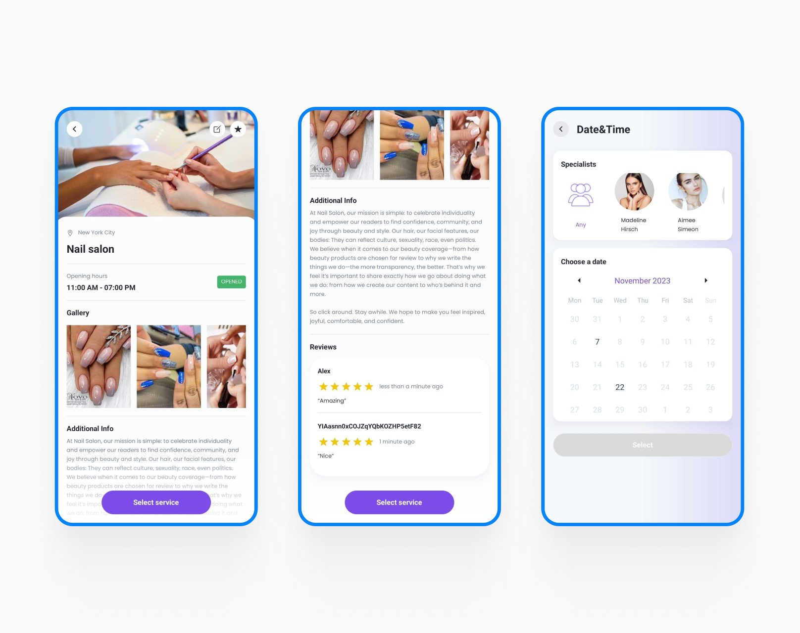
User feedback validated the benefits of our core functionalities – a sophisticated search algorithm, detailed service provider profiles, and an intuitive booking system. This user-centric approach ensures the platform evolves in line with real-world needs. Early user testing identified areas for improvement, which are being addressed through ongoing development.
With a strong foundation in place, we’re poised to expand services and personalize the user experience even further, solidifying our position as the leading platform for connecting beauty professionals with clients.
“Jellyfish’s real-time communication and ability to adapt to InsideOut’s existing team communication tools enabled us to coordinate teams across multiple projects and manage how we worked together most efficiently. Prioritization and delivery of support to the InsideOut’s internal teams within a tight deadline were critical elements of the InsideOut and Jellyfish partnership.”
Is this case in line with what you have planned to build?
Let’s schedule a quick call to explore how we can support your business objectives
